Lettering is necessary in most forms of commercial art. The student of Commercial Art, Cartooning, or Caricaturing should acquire some knowledge of this subject. Therefore, this short chapter is included so that the student may know the first steps in lettering. Oily the most important points in lettering can be treated here, for lettering is a long subject, enough for a book in itself. In fact there are many books published on lettering and the student is advised to obtain a good one on this subject and learn to do good lettering.
Lettering is really not very difficult, but it requires a knowledge of the various strokes, guide lines, forms of letters, and the materials for same. However, practice is necessary to acquire the dexterity required to do good lettering.
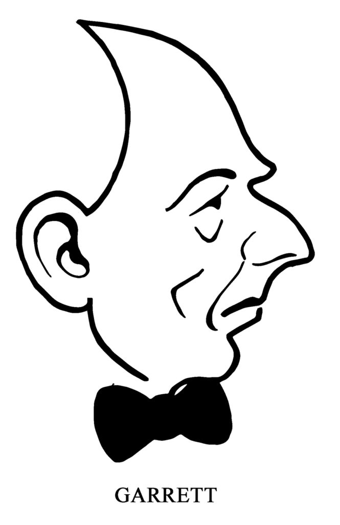
In pen and ink cartoons and caricatures, lettering is often exaggerated, just as the drawings are exaggerated. It should also be of an appropriate style to harmonize with the technique of the drawings-Note how this was done on the plates of this book; especially, the word “Carnegie” on Plate 14. Note the word “Hindenburg” on Plate 7. Block letters were used to harmonize with the caricature, which is also somewhat of a block form. This caricature shows strength of character, and block letters suggest strength and power, so it is apparent that this style of lettering was the most appropriate for this drawing. The shading on the letters is also made to match the drawing.
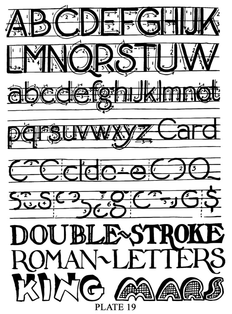
For lettering you should have lettering pens in various sizes and styles, black lettering ink, a T square for making vertical and horizontal guide lines, and pencils, paper, and other materials used for caricaturing. There are three classes of letters used by letter craftsmen. They are, Gothic, Roman, and Text. Gothic letters are those having the elementary strokes of even width. The four top lines on Plate 19 are Gothic. All letters having elementary strokes consisting of light and heavy stroke or rather lines are classified as Roman. Text letters include all styles of Old English, German Text, and the letters derived from the two.
 All slanting fetters are classified as Italics regardless of their other classifications. Therefore Gothic, Roman, and Text, if drawn slanting are designated as Gothic Italics, Roman Italics, and Text Italics, respectively.
Different styles of lettering pens are adapted to the various classes of alphabets. The pen to use is one that will best produce the elementary strokes of a letter with the least amount of effort. For Gothics there is either a round-nib pen, or a square-nib pen. The chisel pointed pen and the oblong-nib pen are adapted to the Roman and Text fetters. However, Romans may be made with a round-nib pen by using double strokes as in the words “DOUBLE-STROKE” on Plate 19.
In the words “King” and “Mars” the letters are outlined and shaded. They are Gothics, also, according to the preceding definition. There is quite a variety of lettering on the other plates in this book which the student may study.
For lettering, square the paper with the drawing board and draw horizontal guide lines with a T square as illustrated on Plate 19. Note the number and distance of these lines, and how the letters are placed between them. As you will see, the small letters b, d, f, h, j, k, 1, and t extend upward from the body of the letters, while the letters g, p, q, and y extend downward. Capitals rest on the line on which the body of the small letters rest, and extend to the uppermost guide line. See “Card” on the plate.
The arrows on the four top lines of lettering illustrate the direction of strokes employed in constructing the letters; and the numerals show the order in which the strokes were made. The beginner should use this plate for a guide, until the strokes and their order have been well learned.
The various strokes overlap in some letters. These complete strokes are illustrated separately on Plate 19, for the letters C, D e, O, Q,S,g,and G.
It is advisable for beginners to draw vertical guide lines, or slanting guide lines for Italics, so that all letters can more easily be made perpendicular, or if Italics with the same slant.
Lettering should first be drawn in with pencil and then with the proper lettering pen. Special care should be given to the layout of lettering in regard to composition, balance, etc.
Spacing of letters is another important item, There is no fixed rule for the spacing of letters. Some require more space than others, and the combination of letters in some words may determine the space. Some letters of the alphabet are broader than others, while some are narrow. The only practical way to determine the proper space for them is, by one’s aesthetic sense; that is, to obtain a pleasing result or effect. Certainly ugly gaps and crowded letters are detrimental to the appearance of lettering.
Lettering provides an outlet for artistic expression, although to a less extent than the fine arts. New letter styles may be originated from the three basic alphabets, and there are many ways of shading them.